$35.00 The original price was: $35.00.$5.99The current price is: $5.99.
Media Grid Responsive Portfolio
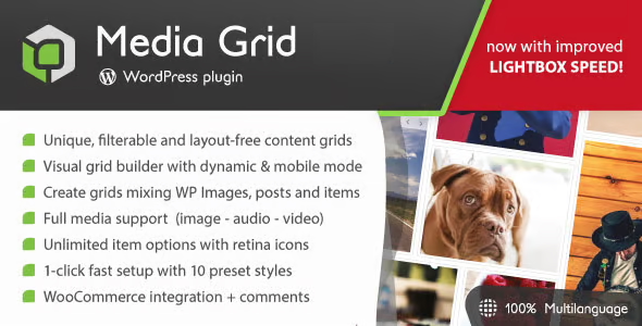
Media Grid Responsive Portfolio is a unique plugin to create unlimited responsive, filterable and paginated portfolios with ease, leveraging the masonry engine.
Using advanced techniques, Media Grid Responsive Portfolio allows you to create your own layouts by mixing any type of media dynamically or manually: adapting to any container!
Responsive Portfolios with Media Grid Responsive Portfolio is a unique tool to create unlimited responsive, filterable and paginated portfolios with ease. Using advanced CSS and JavaScript techniques, you can create your own layouts and adapt them to any container.
Unique means that no tool can repeat itself: forget about fixed rows or patterns, here your creativity can be exploited to the fullest.
What you were looking for.
Worried about the rendering of your setup on small screens? There's a smart system that automatically switches to a simpler, mobile-optimized mode: clearer images, touch-proof sizes, and dynamic control of overlay elements. Everything will always be displayed perfectly in Media Grid Responsive Portfolio.
Finally, Media Grid Responsive Portfolio integrates each element with the most popular social networks (Facebook, Twitter, Pinterest and Google+) providing a better sharing system, focused on the actual content of the element!
Media Grid Responsive Portfolio Features List
- Unlimited portfolios without layout (freely model elements to build grids)
- Visual, drag and drop, grid builder with mobile mode
- Dynamic grids, repeating their base layouts and optionally shuffling elements
- Create grids using any public posts on your website and mixing them with Media Grid elements
- 1-Click Grid Clone System
- 6 paging systems to choose from (including numbered and infinite scroll buttons)
- Complete SEO Deep Linking System: Lightbox, Filter, Search and Pagination Tracking (Tracks Changes in Browser History)
- 100% CSS-based element modeling (super fast)
- Full choice of element type with full media support:
– individual images
– image slider with video support
– online image slider
– Youtube, Vimeo, Dailymotion, self-hosted videos (lightbox and inline)
– Soundcloud and self-hosted audio (lightbox and inline)
– Inline text with video background capability
– Lightbox with custom content
- Link
– Post content – getting posts or custom post types - Element filtering system (optionally search through pages)
- Default Grid Filter – Shortcode Parameter
- 675 icons to beautify filters and customize element overlays
- Search for items in the grid with custom label support (optionally search within pages)
- Filters and search positionable at the top, left or right of the grid
- Animated GIF support
- Revolutionary AJAX lightbox, compatible with HTML and shortcodes
– 5 lightbox content layouts
– 6 lightbox command styles
– 3 lightbox slide/entrance effects
– Unlimited content length without affecting page loading
– Content to text – Height match option
– Image zoom system (for a single image element type)
– Modal mode
– Unlimited custom item attributes with optional icon association
– Appropriate sharing on social media using article data (Facebook, Twitter, Pinterest, Google+) - 16 modern loaders to choose from
- Optional Ken Burns effect for featured articles and lightbox images
- Handy shortcode wizard
- Native integration of Elementor, Visual Composer and Cornerstone
- Shortcode option to move the title of the elements below the image (attached or detached)
- Full control of colors, margins, borders, font size and font family
- Shortcode commands to override pagination system and grid appearance
- 1-click instant setup with 10 preset styles
- Fully responsive, fits any container
- XML Sitemap Elements to insert the content and images of the elements into the search engine
- WooCommerce integration with optional “add to cart” button supporting variable quantity and products
- And more!!
Get Media Grid Responsive Portfolio Now!
Last updated:
Written by: WPClub
With over seven years of experience curating, managing, and distributing GPL products, our content is based on hands-on experience, technical review, testing, and feedback from thousands of users. We aim to democratize and simplify the WordPress world so you can choose with confidence, speed, and ease.
Your Individual Purchase Includes:
- Lifetime updates.*
- Official product, ready to use.
- Immediate access to the product.
- Clean and virus-free files.
- GNU GPL V2/V3 License
- Technical support in Spanish and English.
* In the case of memberships, the period during which you will receive updates will depend on the type of membership purchased: monthly, annual, or lifetime.
Notify Update
We update products Monday through Friday. However, if the product you see is not yet updated, you can notify us so we can prioritize updating it whenever possible.
Get rid of your doubts here
Here you'll find answers to frequently asked questions about our service: how it works, what it includes, and how to get the most out of it.
How many websites can I use the products on?
You can use any product from our store on as many websites as you like.
Will I get updates?
Absolutely. If you buy an individual product, you'll get lifetime updates for that product.
On the other hand, if you purchase a membership, you will have updates until your membership expires.
What if I have a problem?
First of all, we want you to know that you can count on us. We will assist you and provide the necessary support, so you can rest assured.
On the other hand, it is important for you to know that, given the time difference between countries, your time and ours may not be the same, so we will be delayed accordingly.
Our opening hours start at 09 AM from Monday to Friday, UTC -3. We are open until around 18 PM.
Do you provide technical support?
Yes, and regarding time, it is usually on average within 24 to 48 business hours.
However, there are times when we have already provided a response and solution in less than a day depending on the case.
Are there download limits?
No. We don't believe in that format, so you can download as many times as you want. No problem. We pay for high-quality professional storage precisely to avoid problems.
Do you provide license keys?
No. Giving out the keys is not a viable option, as we have had experiences where they end up circulating everywhere and we can even lose the associated accounts.
That said, all products are original and, in cases where a license key is required to function, we will take care of pre-activating them for you.
Does my purchase include an invoice?
Yes. After paying, you will be able to immediately access your invoice in the “Purchases” section of your user account.
This is why it is important that you properly complete the information requested at the time of payment.
Is there a warranty?
Yes, of course. If there's a problem we can't resolve, or if there's an external issue that doesn't have a general solution, you'll receive support and, if necessary, a full refund. We have a 14-day refund policy from the date of purchase.
- It is worth noting that there is no guarantee if the product works well and simply was not what you wanted.
There have been times when a person buys a product, the product works perfectly, but they don't like it and want a refund, keeping the product. That is not appropriate.
Now, everything is evaluable and reasonable. Let's use the criteria together.
What is the attention hour?
Our opening hours are:
- Monday to Friday, from 09 a.m. to 18 p.m.
- Saturday and Sunday: No service.
UTC -3 time

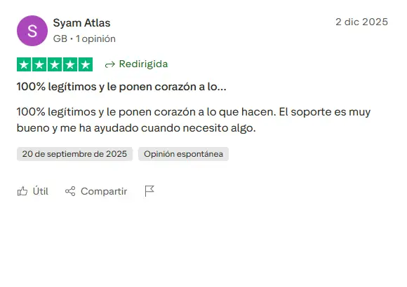
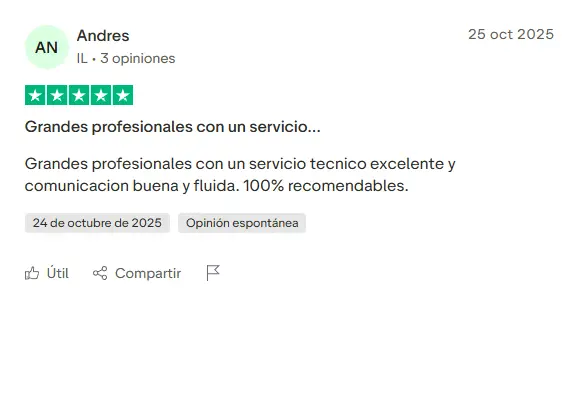
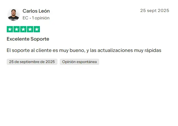
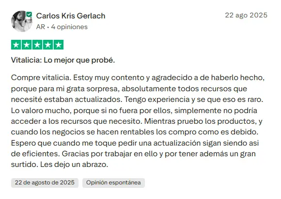
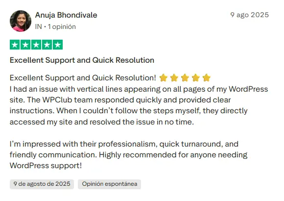
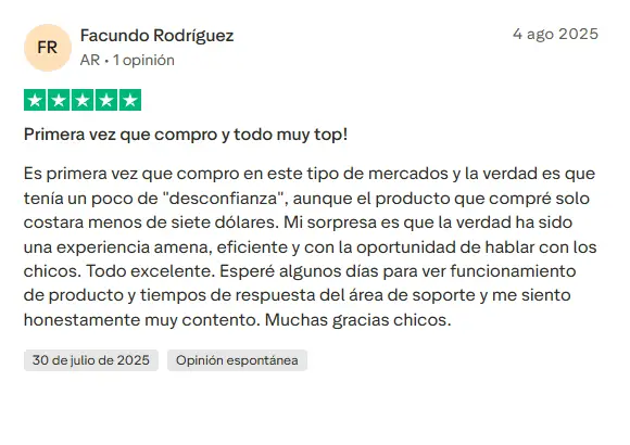
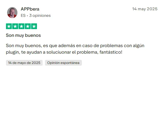
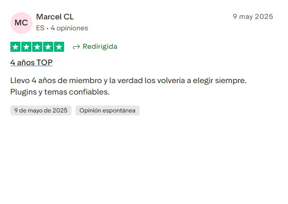
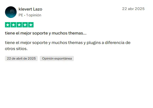
Our Reputation on Trustpilot
Many thanks to those who take the time to give us a review. Trustpilot. Each of your comments is very helpful. We strive to provide a rewarding experience for each member of our community, always with respect and love. We will be here!
WPClub Memberships
Access our entire catalog for a single payment. We offer three memberships: Monthly, Annual, and Lifetime (One-Time Payment).
- Save thousands of dollars
- No daily download limits
- No recurring payments
- Fast Downloads by AWS
- Quality service and support, validated since 2018
- We work with love for our community


