

- Secure payment
- Spanish and English support
- With you since 2018
Responsive Menu Pro 4.7.2
$95.00 El precio original era: $95.00.$5.99El precio actual es: $5.99.
Quick summary
Responsive Menu Pro is a WordPress plugin focused exclusively on navigation menus for mobile devices and small screens. It solves the problem of cluttered, difficult-to-use, or poorly visible menus on mobile devices, transforming them into a clear and accessible experience. It's designed for websites that are already up and running but are losing traffic and conversions because users can't find what they're looking for on their phones or tablets.
What problem does it help solve?
On many WordPress sites, the menu is designed with desktop in mind. In that context, when browsing the site on a mobile device, you'll find overlapping text, overly small icons, unclickable links, and important sections hidden in submenus. When you start noticing users leaving the site without navigating beyond the homepage, the menu is usually the culprit.
Responsive Menu Pro addresses precisely this situation: it reorganizes and presents navigation cleanly for smaller screens. If you've ever had a client say, "I can't find the contact button on my phone," or noticed your menu is cut off on the screen and doesn't display all the pages, the problem isn't just aesthetic; it's a usability issue. This kind of friction prevents users from reaching the product page, the quote request form, or the key content you want to highlight.
In real-world projects, this navigation chaos arises as the site grows: you add categories, service pages, a blog, a private area, perhaps an e-commerce platform, and your theme's standard menu stops adapting well. Responsive Menu Pro helps manage this growth so that the entire structure remains navigable from any device without forcing you to redesign the whole site.
Why this solution makes a difference
The impact is noticeable in the daily administration experience and in end-user behavior. On the one hand, you have a system focused on the responsive menu, making it easy to adjust navigation without affecting the rest of the design. This reduces the risk of errors when modifying sensitive theme elements and allows you to fine-tune how the menu unfolds, the order of the links, and the visual hierarchy on mobile devices.
On the other hand, for website visitors, the change translates into fewer taps to reach the desired section, clear touch elements, and intuitive paths to key products, services, or content. In this environment, a well-configured menu has a direct impact on metrics such as time spent on page, pages viewed per session, and even the likelihood of the user completing a specific action, such as submitting a form or finalizing a purchase.
Furthermore, by separating it from the theme, Responsive Menu Pro makes it possible to maintain consistent navigation even if you change the main design later. This way, the work invested in organizing the menu isn't lost every time you modify the overall appearance of the site.
Signs you need this product
- Problem already present on the site: The mobile menu covers the logo, is cut off in the middle of the screen, or some elements are not displayed on certain devices.
- Friction in WordPress or WooCommerce: Users who cannot find product categories, their shopping cart, or access to their account from their phone, leading to abandonment at key steps.
- Loss of control or time: Every time you try to adjust the menu from the theme options, you end up breaking another design element or investing too many trial and error attempts.
- Typical growth scenario: Your project has grown from 5 to 20 sections, you manage several landing pages, and you notice that the standard menu no longer provides a clear structure, especially on mobile devices.
When does it make sense to use it (and when doesn't)
Responsive Menu Pro provides value when mobile navigation design has become a bottleneck: content-heavy sites, online stores, corporate websites with multiple service lines, or projects that need to effectively guide users between different areas. It's also ideal for situations where you want to experiment with different menu configurations without risking modifying the theme's code.
It's not as necessary on very small pages with just two or three header links, where the theme's native menu is already clearly displayed without any space issues. In these cases, adding an extra layer of configuration may not provide a noticeable improvement. It's also not designed for managing content, SEO, or other aspects unrelated to navigation; its focus is on the presentation and organization of the menu, not the complete construction of the site.
Who it fits best for
- WordPress Developers and Implementers who need to precisely control how the menu behaves on mobile devices without redoing the entire theme or writing complex code for each project.
- Online store owners They want their customers to quickly find categories, promotions, and account options from their smartphones, reducing abandonment during product exploration.
- Marketing agencies and professionals that manage multiple landing pages and campaign websites and require consistent, clear navigation aligned with conversion goals on any device.
Practical benefits
- Real operational improvement: You centralize mobile menu decisions in a single panel, simplifying maintenance when you add new sections or reorganize your offering.
- User experience: The visitor finds well-organized links, accessible touch elements, and clear paths, reducing frustration and unnecessary clicks.
- Control and organization: You have greater ability to decide what to display, how to group options, and what to prioritize on small screens without being limited by rigid theme constraints.
- Time saving: Instead of adjusting the menu in multiple places or trying different templates, you focus on an environment designed for adaptive navigation and reduce iterations.
- Error reduction: By separating menu management from other sensitive parts of the design, you decrease the likelihood of breaking the entire header when you only want to change the navigation structure.
How it fits within WordPress
Within the WordPress workflow, Responsive Menu Pro sits right between the content and the overall theme design. On one hand, no matter how many pages, posts, or products you create, the menu is the map that connects them all. On the other hand, the theme defines the overall look of the site, but it doesn't always handle the menu's responsiveness well on mobile devices. At that point, Responsive Menu Pro acts as the layer that translates the site's structure into practical and consistent navigation on any screen size.
When working on a new project, you can plan from the outset how you want the navigation to look on mobile and desktop without being tied to the limitations of the theme. On existing sites, it allows you to rearrange and improve usability without changing the colors, fonts, or blocks you've already configured. This way, it fits naturally within the WordPress ecosystem as a specialized tool for guiding the user through the content.
Typical use cases
- Real-world use in ecommerce or projects: Stores that need to display categories, key filters, a deals section, and user account access cleanly in a single, clear mobile navigation.
- Specific case study: A service website with several areas (consulting, training, free resources, blog) that reorganizes its mobile menu so that the visitor first identifies the contact and quote request routes.
- Situation where it provides direct value: projects where statistics show high traffic from smartphones and tablets, but a low percentage of interaction with internal sections due to a difficult-to-use menu.
Frequently Asked Questions about Responsive Menu Pro
On what types of sites does it make the most sense to use Responsive Menu Pro?
Responsive Menu Pro offers the most value on sites with multiple navigation levels: projects with many service pages, stores with numerous categories, online academies, or content portals. When the menu includes sub-levels, links to private areas, and paths to various key sections, having specific control over how that information is displayed on mobile devices makes all the difference. On very simple websites with few links, the impact is less significant, although it can still help to unify the visual experience.
What makes Responsive Menu Pro different from relying solely on the theme's menu?
The menu included with a theme is usually designed as part of an overall layout and often offers few mobile-specific options. Responsive Menu Pro focuses solely on navigation, allowing for greater customization: prioritizing certain sections on smaller screens, deciding how the menu opens, which elements are highlighted, and how links are grouped. All of this is possible without requiring you to change your theme or make complex code modifications.
How does Responsive Menu Pro help improve the mobile experience?
The mobile experience is enhanced because users encounter navigation designed for their context: clear menus, visible paths to important information, and key actions accessible in just a few taps. This is especially important when the site structure is extensive and the standard menu falls short in terms of organization. Responsively Menu Pro allows you to organize and display content so that users browsing from their phones can quickly find what they're looking for, reducing feelings of being lost or confused.
Is Responsive Menu Pro useful if my WordPress site already looks good on desktop?
A website that looks good on desktop doesn't guarantee comfortable navigation on mobile. Responsive Menu Pro becomes relevant when you notice gaps between the two experiences: menus that turn into endless lists, small links, or paths to relevant sections poorly positioned on smaller screens. If you have significant mobile traffic and users aren't interacting with internal pages, using this tool to optimize your responsive navigation helps align a good desktop look with solid usability on phones and tablets.
At what stage of project growth is it advisable to incorporate Responsive Menu Pro?
It's especially useful when you're moving from a simple website to a more complex project: adding new lines of business, launching an e-commerce site, incorporating downloadable resources, or creating a client area. During this process, the original menu no longer accurately reflects the site's actual structure, particularly on mobile devices. Incorporating Responsive Menu Pro at this point allows you to reorganize the navigation without completely redesigning the site, ensuring that content growth doesn't result in a chaotic user experience.
Conclusion
Responsive Menu Pro exists to solve a specific and common problem in WordPress: menus that work on desktop but fail when users browse from mobile devices. By focusing on responsive navigation, it helps ensure your site's structure is clear, accessible, and consistent with your goals. If your project depends on people quickly finding what you offer, a well-designed menu is no longer just an aesthetic detail, but a key component of the daily digital experience.
Your individual purchase includes:
- Lifetime updates.*
- Product ready to use.
- Immediate access to the product.
- Clean and virus-free files.
- GNU GPL V2/V3 License
- Technical support in Spanish and English.
* In the case of memberships, the period during which you will receive updates will depend on the type of membership purchased: monthly, annual, or lifetime.
Get your questions answered here
Here you'll find answers to frequently asked questions about our service: how it works, what it includes, and how to get the most out of it.
On how many websites can I use the products?
You can use any product from our store on any website you want.
Will I get updates?
Absolutely. If you buy an individual product, you'll get lifetime updates for that product.
On the other hand, if you purchase a membership, you will receive updates until your membership expires.
What if I have a problem?
First of all, we want you to know that you can count on us. We will assist you and provide the necessary support, so you can rest assured.
On the other hand, it is important for you to know that, given the time difference between countries, your time and ours may not be the same, so we will be delayed accordingly.
Our opening hours start at 9 AM from Monday to Friday, UTC -3. We are open until around 6 PM.
Do they provide technical support?
Yes, and regarding the time, it is usually on average within 24 to 48 business hours.
However, there are times when we have already provided an answer and solution in less than a day, depending on the case.
Are there download limits?
No. We don't believe in that format, so you can download as many times as you want. No problem. We pay for high-quality professional storage precisely to avoid problems.
Do they provide license keys?
No. Giving out the keys is not a viable option, as we have had experiences where they end up circulating everywhere and we can even lose the associated accounts.
That said, all products are original and, in cases where a license key is required to function, we will take care of pre-activating them for you.
Does my purchase include an invoice?
Yes. After payment, you will be able to access your invoice immediately in the "Purchases" section of your user account.
That is why it is important that you properly complete the information requested at the time of payment.
Is there a warranty?
Yes, of course. If there's a problem we can't resolve, or if there's an external issue that doesn't have a general solution, you'll receive support and, if necessary, a full refund. We have a 14-day refund policy from the date of purchase.
- It should be noted that there is no warranty if the product works well and it simply wasn't what you wanted.
There have been instances where someone buys a product, the product works perfectly, but they don't like it and want a refund, keeping the product. That's not right.
However, everything is evaluable and reasonable. Let's use judgment together.
What are the opening hours?
Our opening hours are:
- Monday to Friday, from 9 a.m. to 6 p.m.
- Saturday and Sunday: No service.
UTC -3 time

Reviewed by the WPClub team
At WPClub, we carefully review each product before listing it. Our team evaluates its key features, compatibility, and performance to provide you with reliable, up-to-date, and helpful information when choosing and using each resource available in our store.
Download previous versions
If you have purchased this product, or have an active membership, you can download previous versions as we release them, without any limits or restrictions.
| Nombre del producto | Versión | Tamaño | Fecha | Descargar |
|---|---|---|---|---|
| No hay versiones anteriores registradas. | ||||

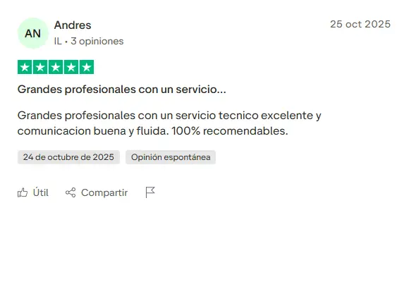
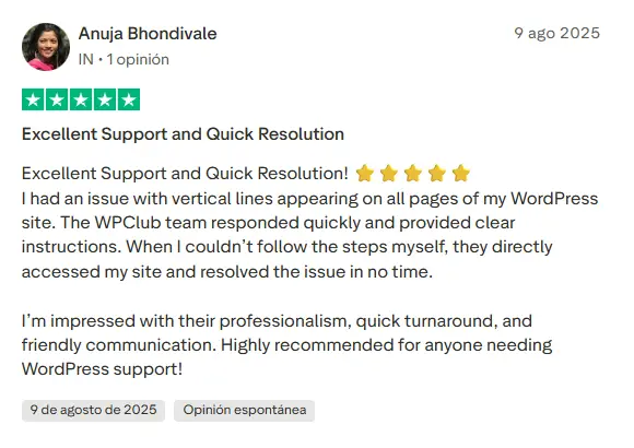
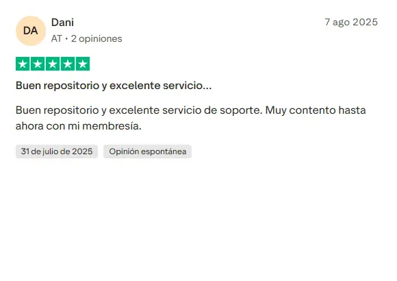
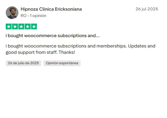
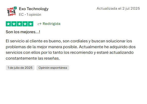
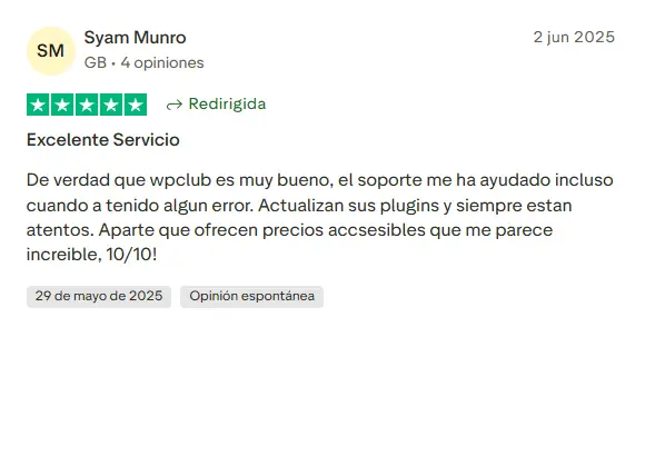
Our Reputation on Trustpilot
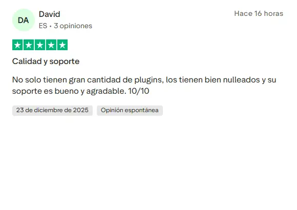
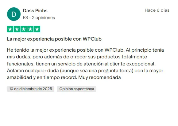
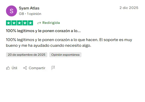
Many thanks to those who take the time to give us a rating on Trustpilot. Each and every one of your comments is very helpful to us. We strive to provide a rewarding experience for every member of our community, always with respect and care. We'll be here!












WPClub Memberships
Access our entire catalog for a single payment. We offer three memberships: Monthly, Annual, and Lifetime (One-Time Payment).
- Save thousands of dollars
- Unlimited daily downloads
- No recurring payments
- Fast downloads by AWS
- Quality service and support, validated since 2018
- We work with love for our community